I think of ad design as a puzzle. Every placement comes with its own set of pieces: a limited amount of space, a message that has to come through clearly, and only a moment to catch someone's attention and hold it. Figuring out how to fit those pieces together so the final ad feels effortless is what keeps this work interesting for me.
This gallery brings together ads I've designed at Go Fish Digital for Google Display, LinkedIn, and social media. The clients span email marketing platforms, workforce development companies, and consulting firms, each with its own audience and its own way of speaking to them. What stays the same is the goal: a clear, well-crafted ad that earns a second look and moves people toward the next step.





CREO is a life sciences consulting firm, for them I designed a series of ads that would feel credible to a scientific audience while still standing out in a busy feed. I pulled a range of imagery from the field, from cell-like droplets to bacterial cultures to microscope close-ups, so each ad feels distinct while clearly belonging to the same set. A consistent layout, a clean sans-serif headline, and an orange CTA button that echoes CREO's branding tie the series together and make the next step easy to spot.
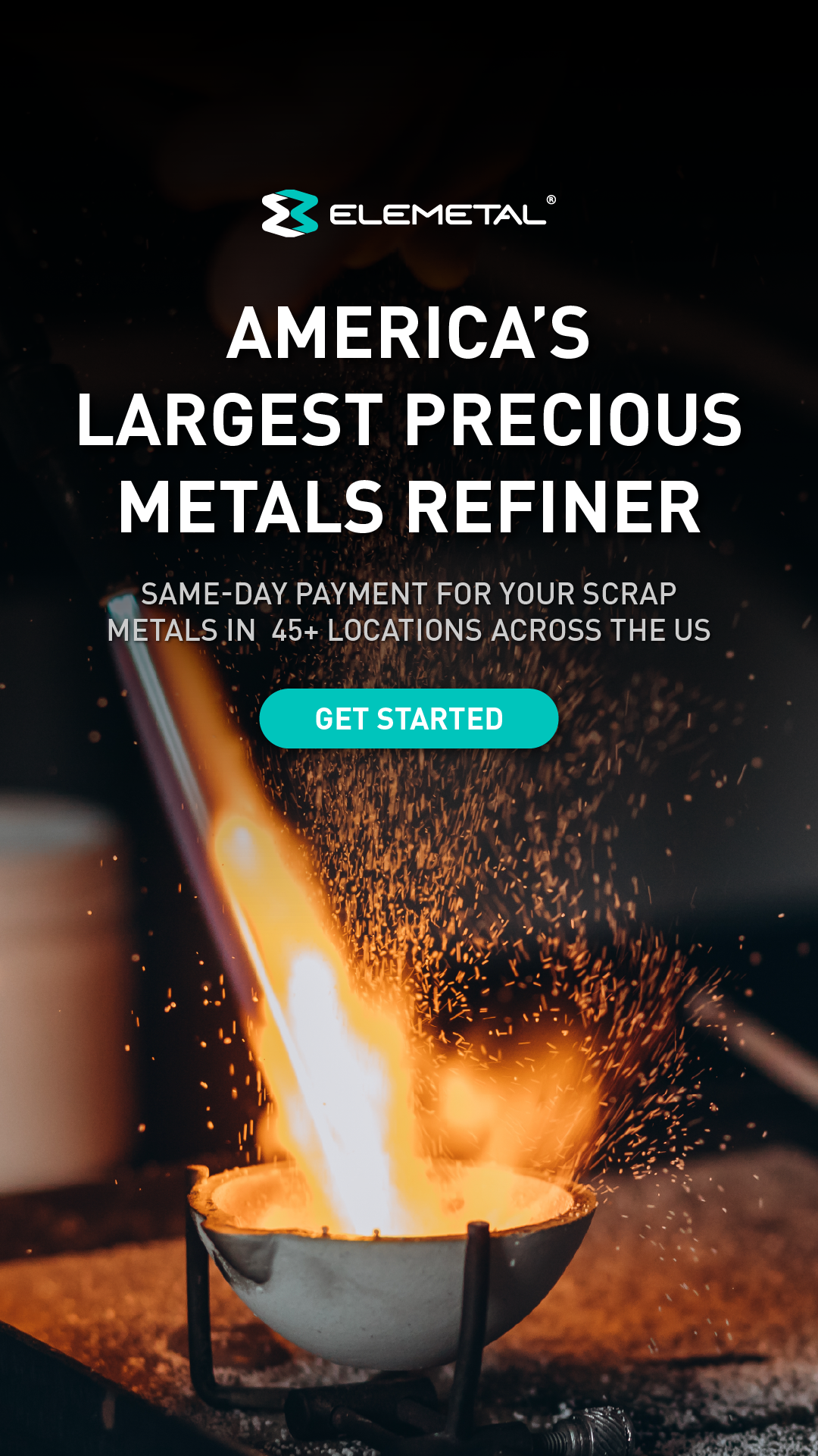

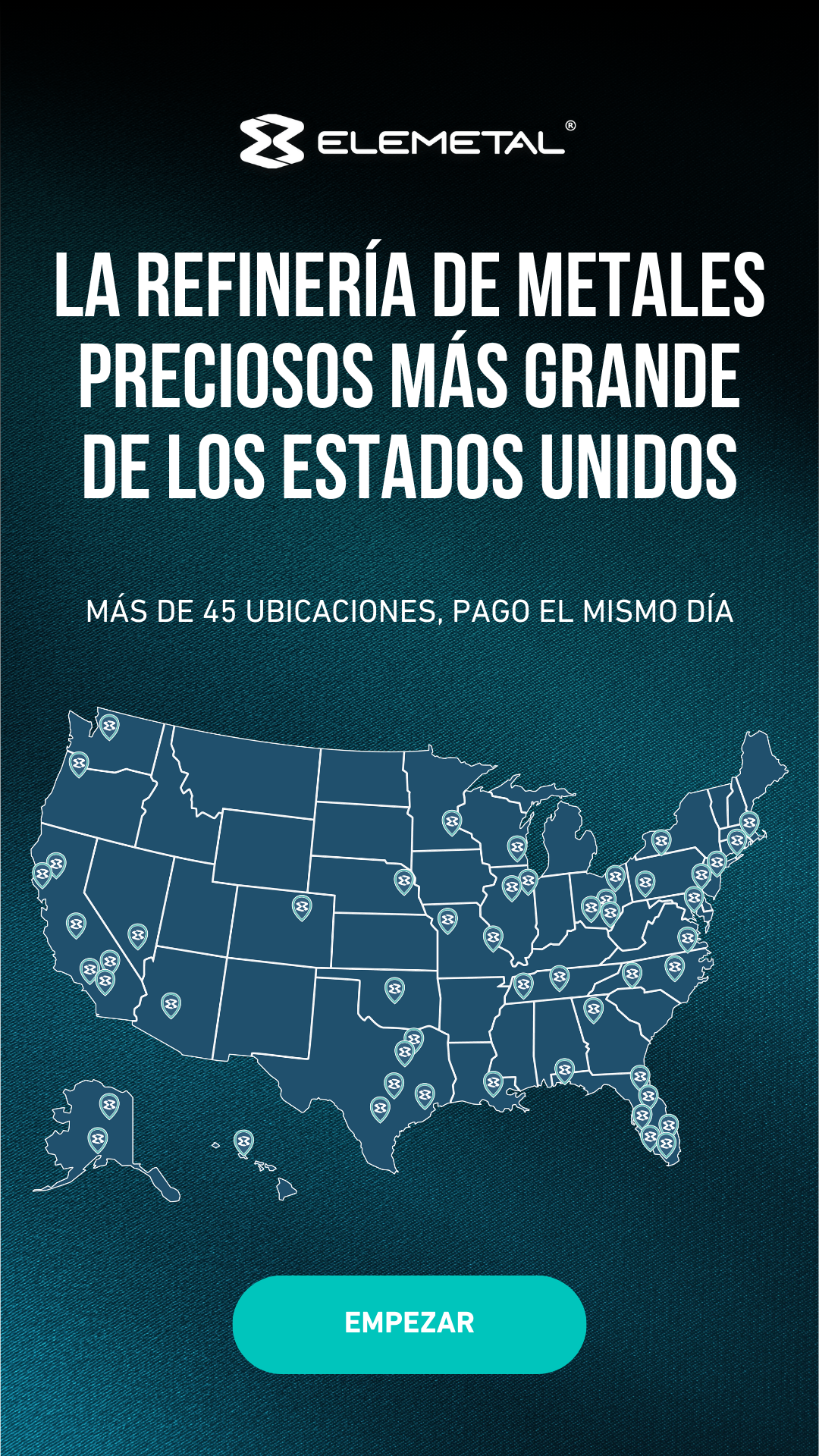

For Elemetal, a precious metals refiner, I sourced metalsmithing photography, like molten metal and flying sparks, to give the ads energy and a sense of craft that generic industrial imagery couldn't. I then developed a set of templates to keep the brand consistent across every placement, pairing bold uppercase headlines with a bright teal CTA and a map highlighting their 45+ locations. Each ad was also produced in Spanish, allowing the campaign to reach Elemetal's Spanish-speaking audience with the same look and message.





I designed ads promoting everything from white papers, guides, and conferences to podcasts and the firm's core services for Alvarez & Marsal, a global professional services firm. Over time, I evolved the design style to keep the campaigns feeling fresh, experimenting with bold diagonal color blocks, duotone photography, and dark, moody overlays while staying anchored in A&M's navy, blue, and gold palette. That balance let each new ad feel current without losing the polished, authoritative look the brand is known for.



For iContact, an email marketing platform, I followed their brand guidelines closely and matched the style of their website, carrying over the bold blue content panels, rounded corners, and bright CTA buttons so each ad feels like a natural extension of the site. To keep that clean, simple structure from feeling flat, I used layering to add depth, letting subjects overlap the text panel so the photo and message read as one piece. The result is a friendly, polished set of ads that feels unmistakably iContact at a glance.






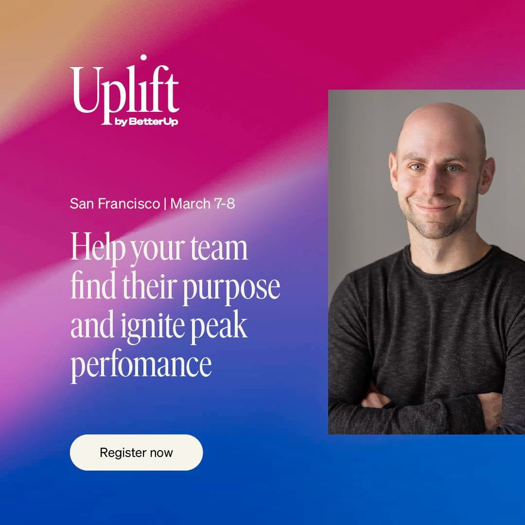


With BetterUp, I worked within strict brand guidelines to create ads that feel unmistakably on-brand, from the refined serif headlines to the signature magenta CTA button. Each ad was built around client-provided photography, so much of the work came down to composition: placing copy where it reads clearly without competing with the people in the shot. From wide banners to tall vertical placements and square social posts, I tailored every layout to its size so the message stays clear and the imagery holds up in any format.