Piranha Nail and Staple, a specialized distributor in the Piedmont Triad, required a visual overhaul to transition from a "local shop" feel to a dominant industry presence. The primary challenge was to create an identity that maintained high legibility and "glance value" in high-speed and high-activity environments, specifically on highways and active construction sites.
The centerpiece of the brand is a custom-illustrated piranha mascot—engineered with sharp, industrial lines to communicate the "tough as nails" nature of the product line. This was paired with a bold, heavyweight sans-serif typeface to ensure the brand name remains legible even from a distance. The high-contrast "Power Red" palette was selected to cut through the neutral tones of typical job site backgrounds.
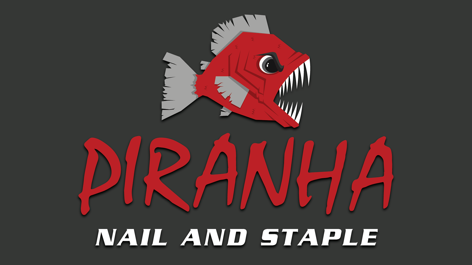
Full color Piranha Nail and Staple logo

Full color, greyscale, and black and white versions of the Piranha Nail and Staple logo
Uniforms and apparel
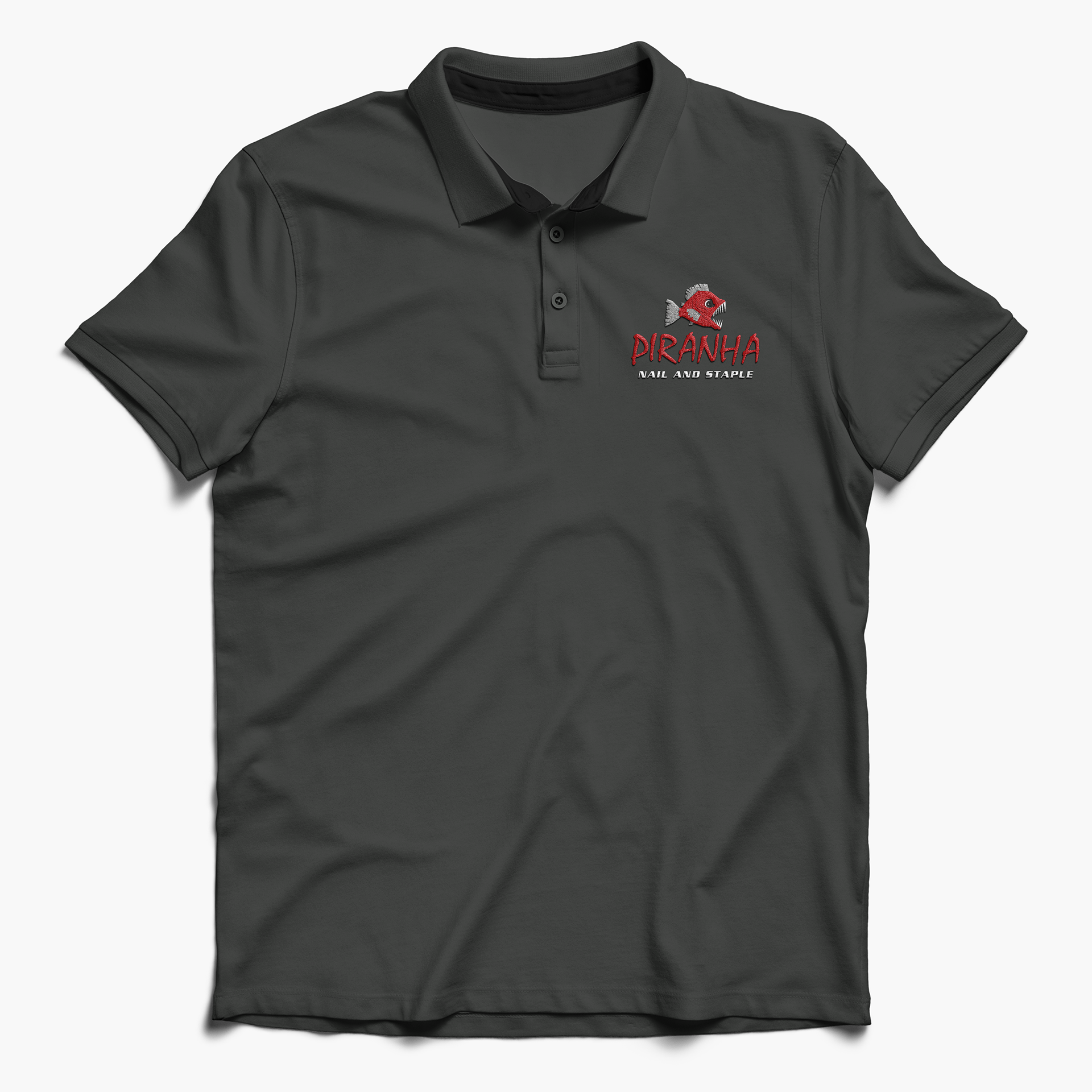
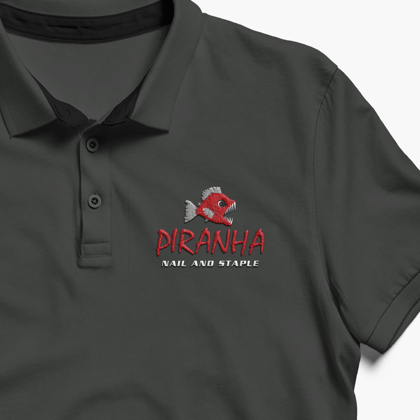
To balance the brand’s aggressive energy with a professional service image, the company polos feature a refined, embroidered application of the logotype. This ensures a cohesive and authoritative look for staff during client consultations and high-level distribution meetings.
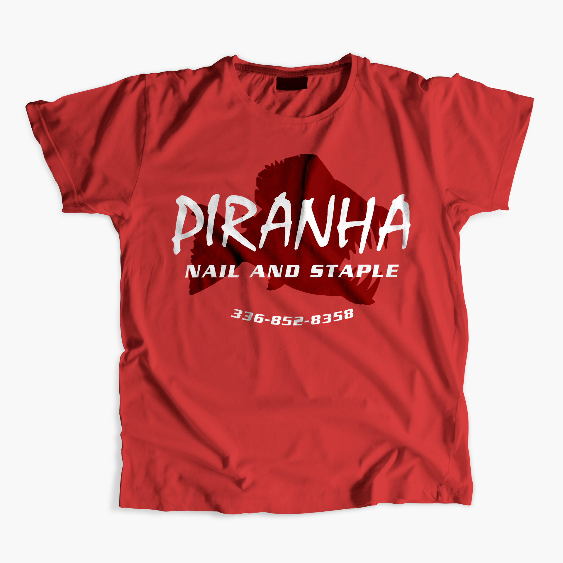
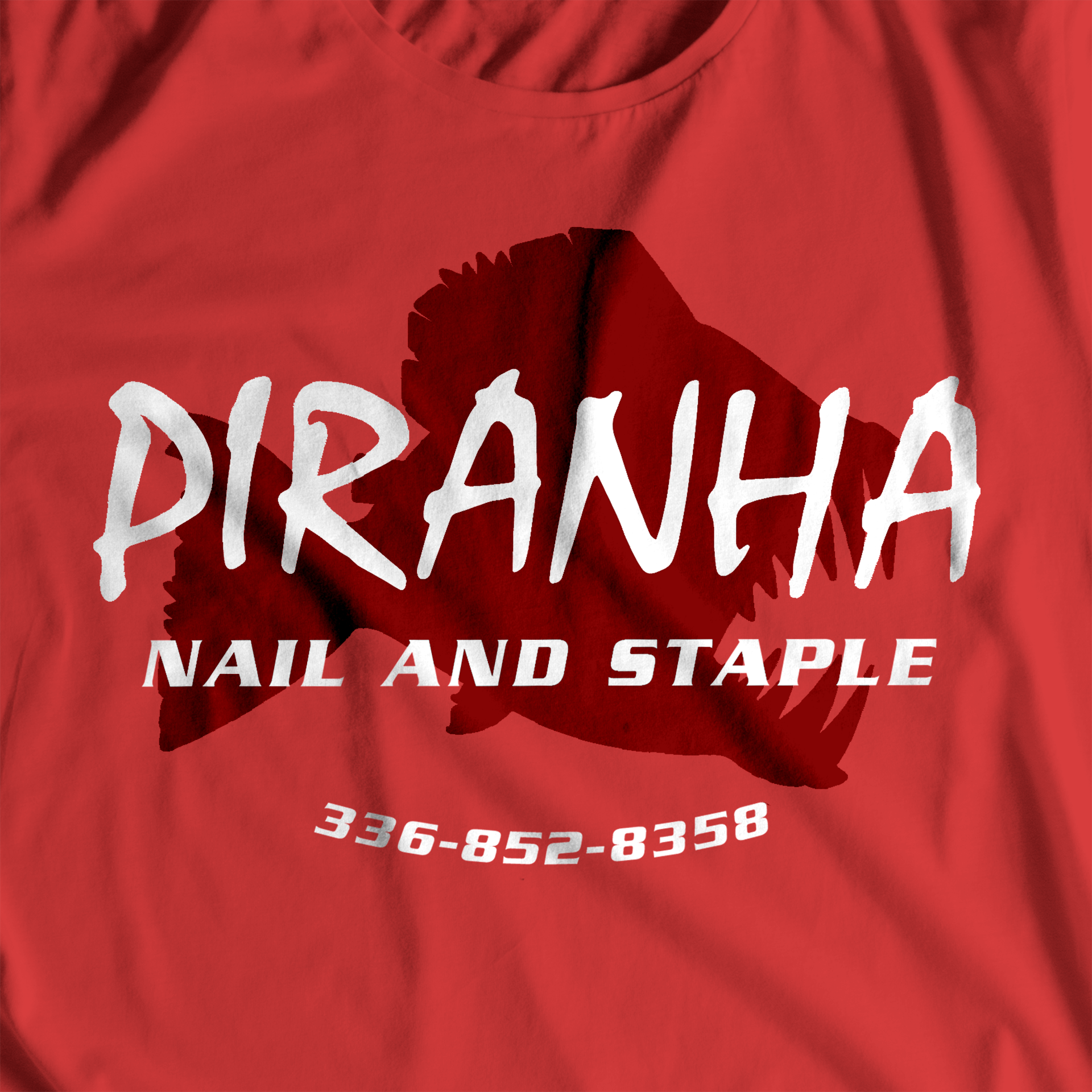
Designed for durability and style, these promotional tees translate the brand’s "tough-as-nails" persona into wearable marketing. The composition prioritizes a bold chest graphic that makes the brand easily recognizable on active job sites, turning customers into brand ambassadors.
Signs
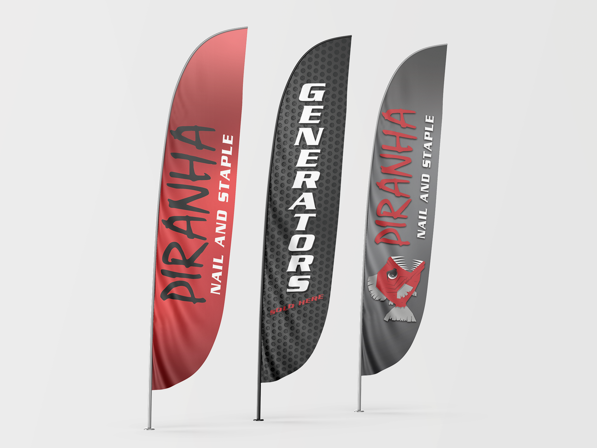
High-impact feather flags were designed to break through the visual noise of an industrial park. Utilizing the primary brand red and the simplified piranha icon, these assets serve as high-visibility markers that guide customers to the storefront while reinforcing the brand’s bold presence from a distance.
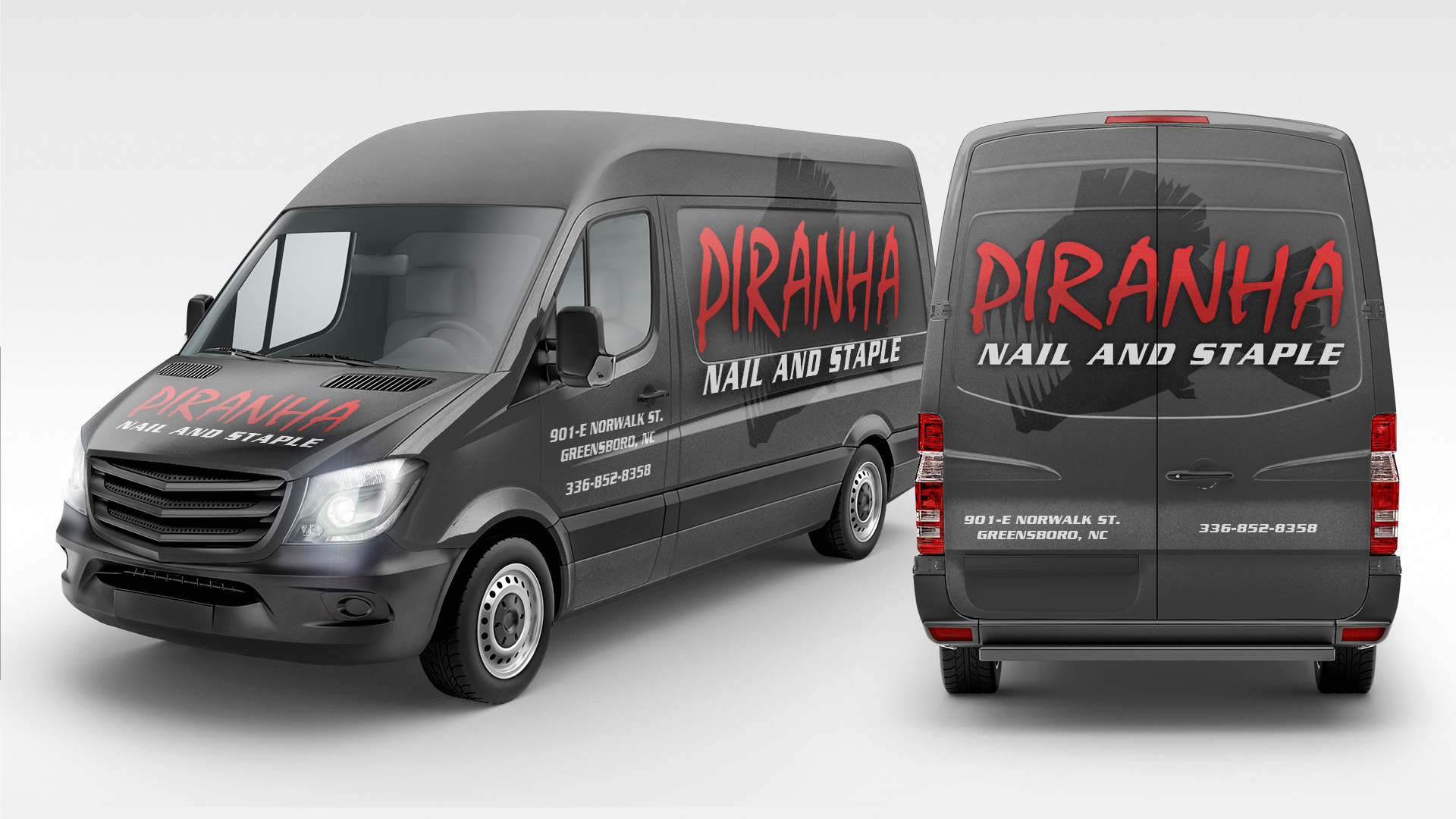
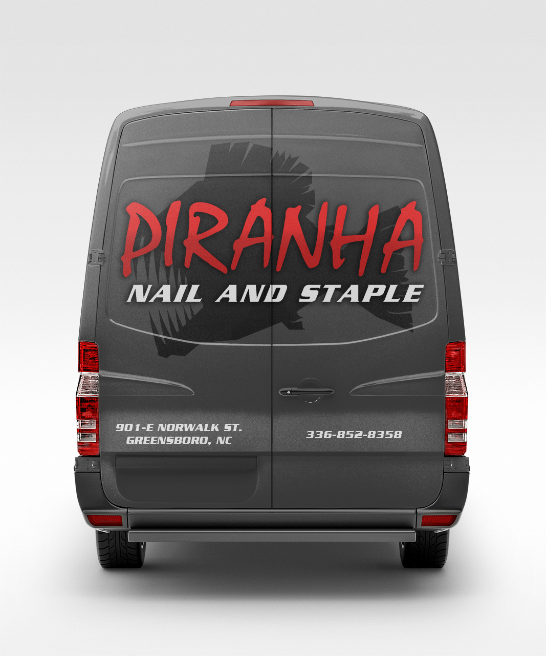
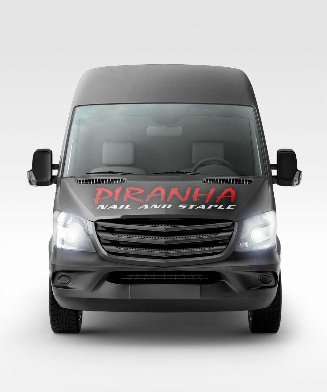
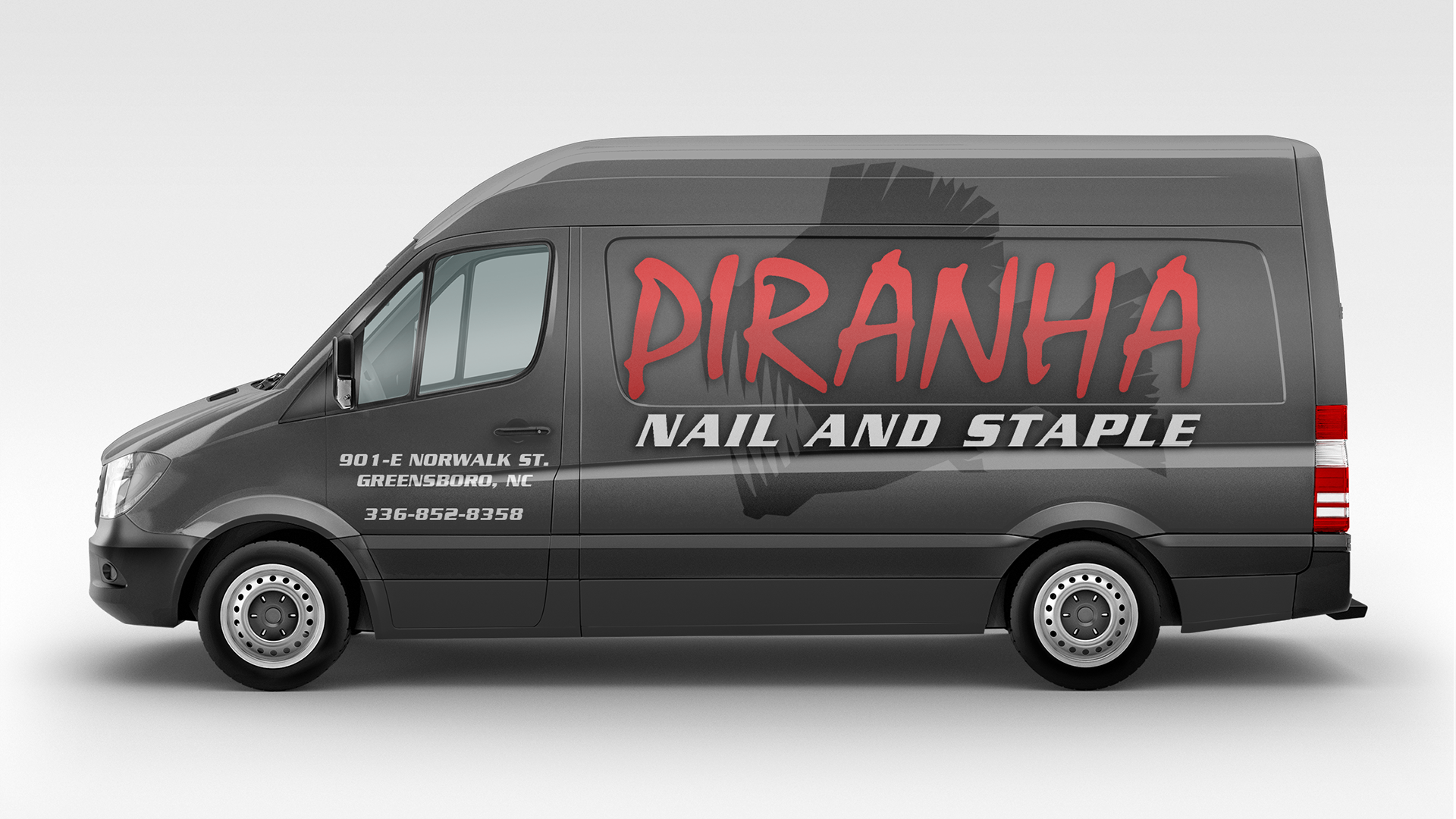
Van Wraps
The vehicle wrap maximizes "glance value" for highway transit. By scaling the piranha mascot across the side panels and utilizing heavy-weighted typography for the contact information, the design transforms a standard utility van into a rolling billboard that communicates toughness and reliability at 70 mph.
The modularity of the new "Piranha" system allows the icon and typography to work as a unified mark or as independent elements across diverse media. This cohesive toolkit has provided the business with a "big brand" footprint, establishing them as a recognizable, professional leader in the Greensboro construction market.