For High Risk Pay’s “Slice by Slice: Here’s How Each State Takes Its Pizza” campaign, I created a suite of graphics that helped transform a data-heavy survey into a fun, digestible, and highly shareable content experience. The campaign was based on responses from 2,125 U.S. adults about pizza preferences, ordering habits, favorite chains, toppings, sides, and annual pizza spending.
The design challenge was to make a large amount of state-by-state information feel easy to understand at a glance. Rather than treating the visuals as simple charts, the graphics were designed to feel editorial, playful, and campaign-driven, using familiar pizza cues, bold data callouts, and map-based storytelling to guide readers through the findings.
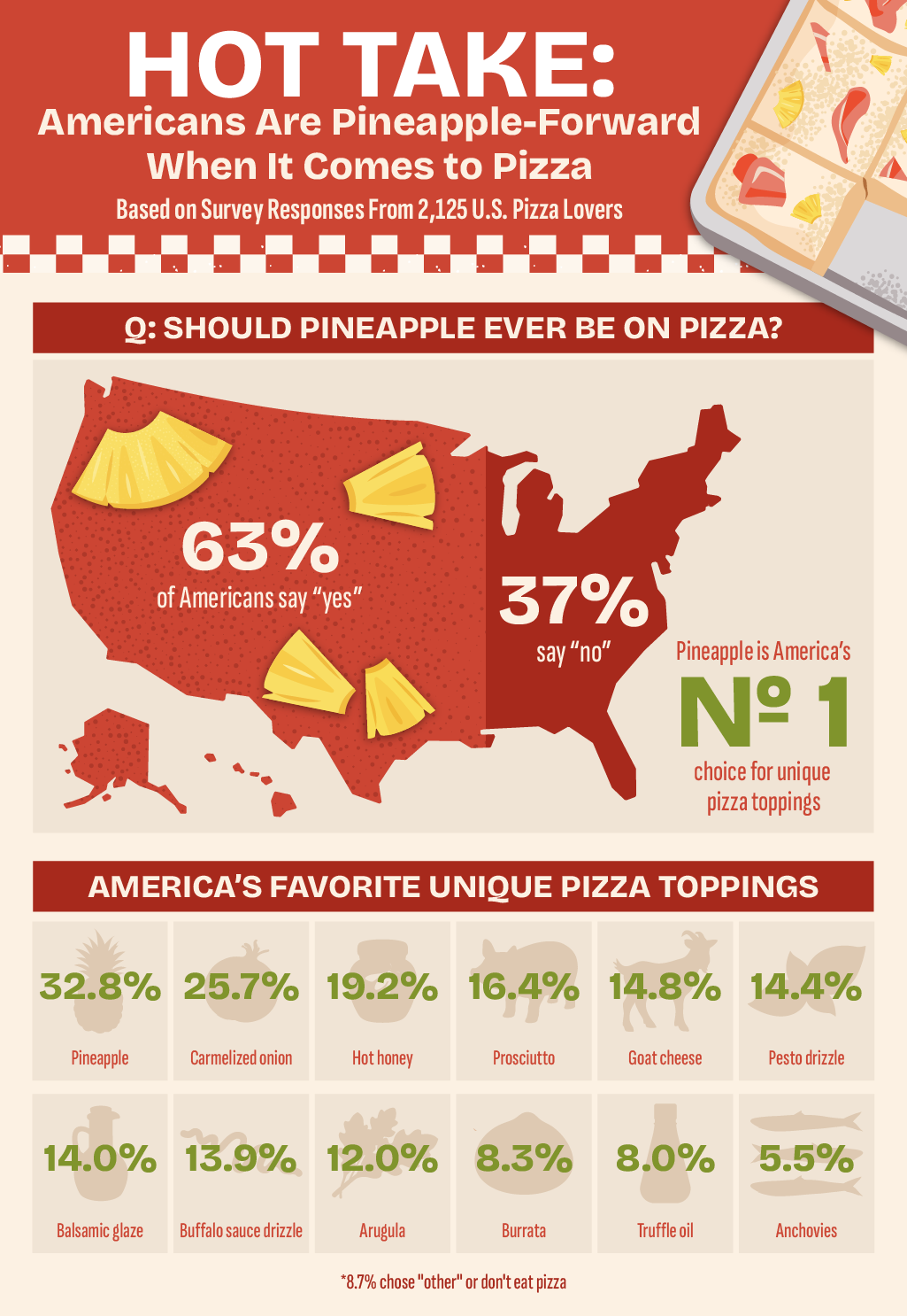
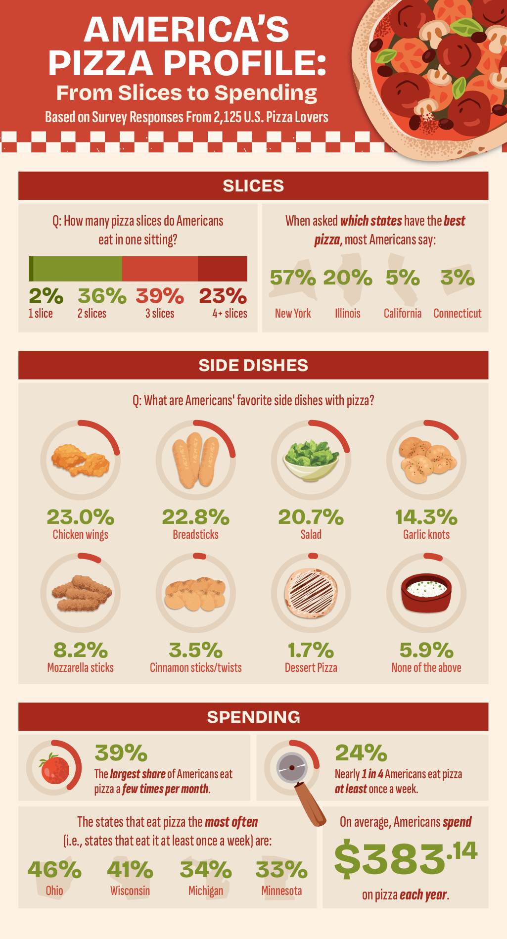
The visual system included a campaign header graphic, U.S. map graphics, and supporting infographic-style layouts covering topics such as pineapple on pizza, pizza spending, eating frequency, side dishes, and ordering behavior. The page highlights findings such as pepperoni ranking as the most popular pizza style nationally, pineapple being accepted by 63% of Americans, and Michigan, New York, Ohio, and Minnesota reporting some of the highest annual pizza spending.
My approach focused on balancing clarity and personality. Since the topic was lighthearted, the graphics needed to feel fun and approachable, but the data still had to remain organized and credible. Color, iconography, hierarchy, and geographic layouts were used to help readers quickly compare states, identify standout statistics, and move through the article without getting overwhelmed.
The final graphics helped elevate the campaign from a written study into a more engaging visual experience. By making the survey findings easier to scan, share, and remember, the design supported High Risk Pay’s broader content strategy while tying the pizza-ordering theme back to restaurants, food delivery businesses, and the need for reliable payment infrastructure.