Byroe is a New York–based clean beauty brand built on upcycled superfood ingredients and Korean skincare heritage. I designed their email marketing program: dozens of campaigns supporting product launches, retail partnerships, routine education, and bundle merchandising.
Beauty is one of the most crowded inboxes there is, and most of it shouts a discount from the first pixel. Byroe needed emails that did aggressive commercial work while holding the editorial, premium register that separates them from mass-market competitors — at a volume no one can design from scratch each time.

The approach
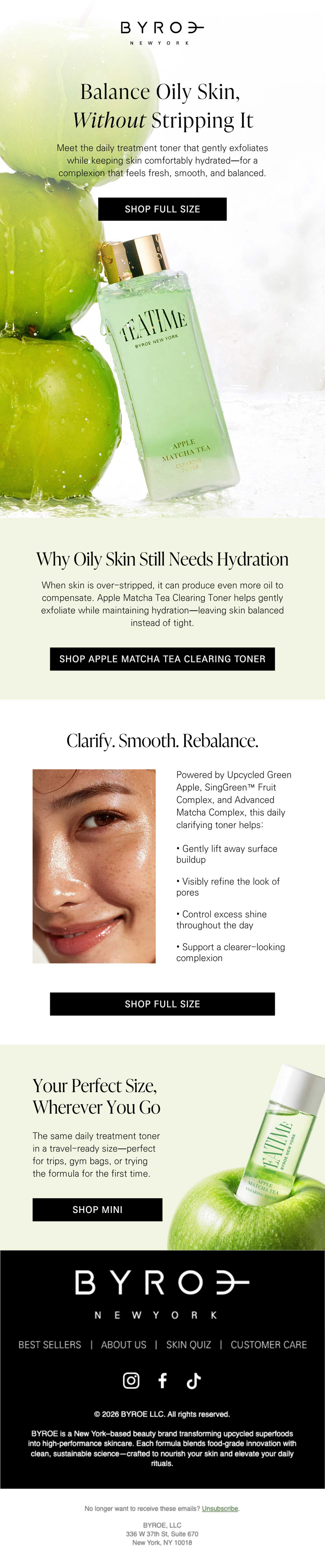
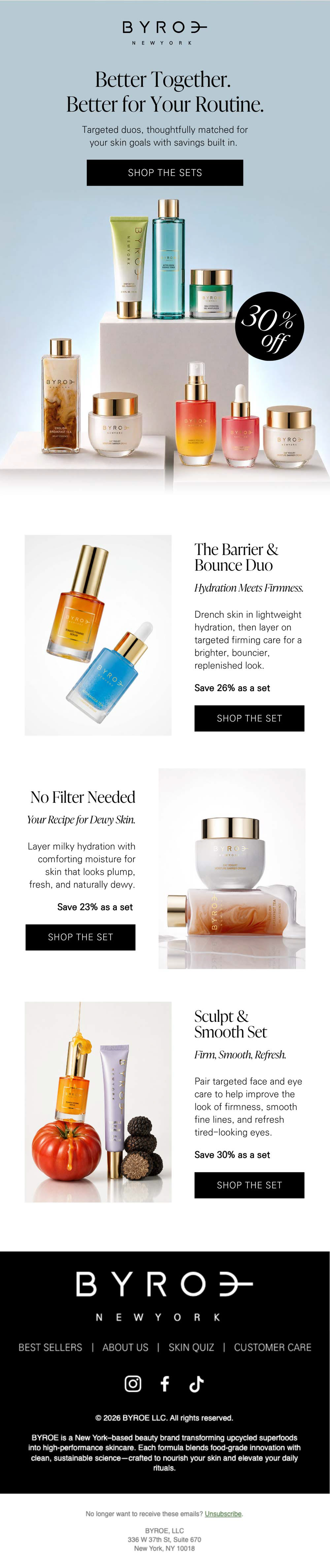
A modular section library. I built the program around interchangeable module types — hero, benefit, ritual, proof, cross-sell, bundle — each self-contained with its own background, headline, and CTA. Any new campaign becomes a decision about which arguments to make and in what order, rather than a layout problem solved from a blank canvas. That's what let the program scale without flattening into a template.
Ingredient-driven color. Rather than force one palette across every send, each campaign takes its temperature from its hero ingredient — warm amber for tomato, cool sage for apple matcha, foam-light gray for black rice. Constant off-white and near-black framing keeps every email in the same family while no two feel alike. It also keeps the ingredient the hero, which is the brand's entire differentiator.
Strict typographic division. High-contrast serif for anything meant to be felt; letterspaced sans for anything meant to be acted on. A recurring three-word triad headline — "Firm. Smooth. Glow." — became a program-level device that works at any screen width.
CTA architecture. Every module ends in a button, but no two are interchangeable. Each restates the specific reason to click at that point in the scroll, so a subscriber who bounces off the hero still hits a reason to convert further down.